It took a while to connect the dots, but Fredericksburg City Public Schools officially unveiled its new branding on Tuesday morning during a ceremony at the Walker-Grant Center.
The school division’s rebranding process began in November 2022 and included the formation of two committees and a public survey. In January, the school board unanimously approved a new mission, vision and tagline, and the body approved the logo at its June meeting.
Revisiting her notes from the start of the process, FCPS Superintendent Marci Catlett recounted Tuesday that it was “a perfect time” to explore rebranding, as the division had recently celebrated its 150th anniversary.
“Your brand is how people feel when your school division is mentioned,” Catlett said. “It is what differentiates your school from other school divisions. A clear brand describes who you are, who you want to be, and who people perceive you to be. It’s your culture.”

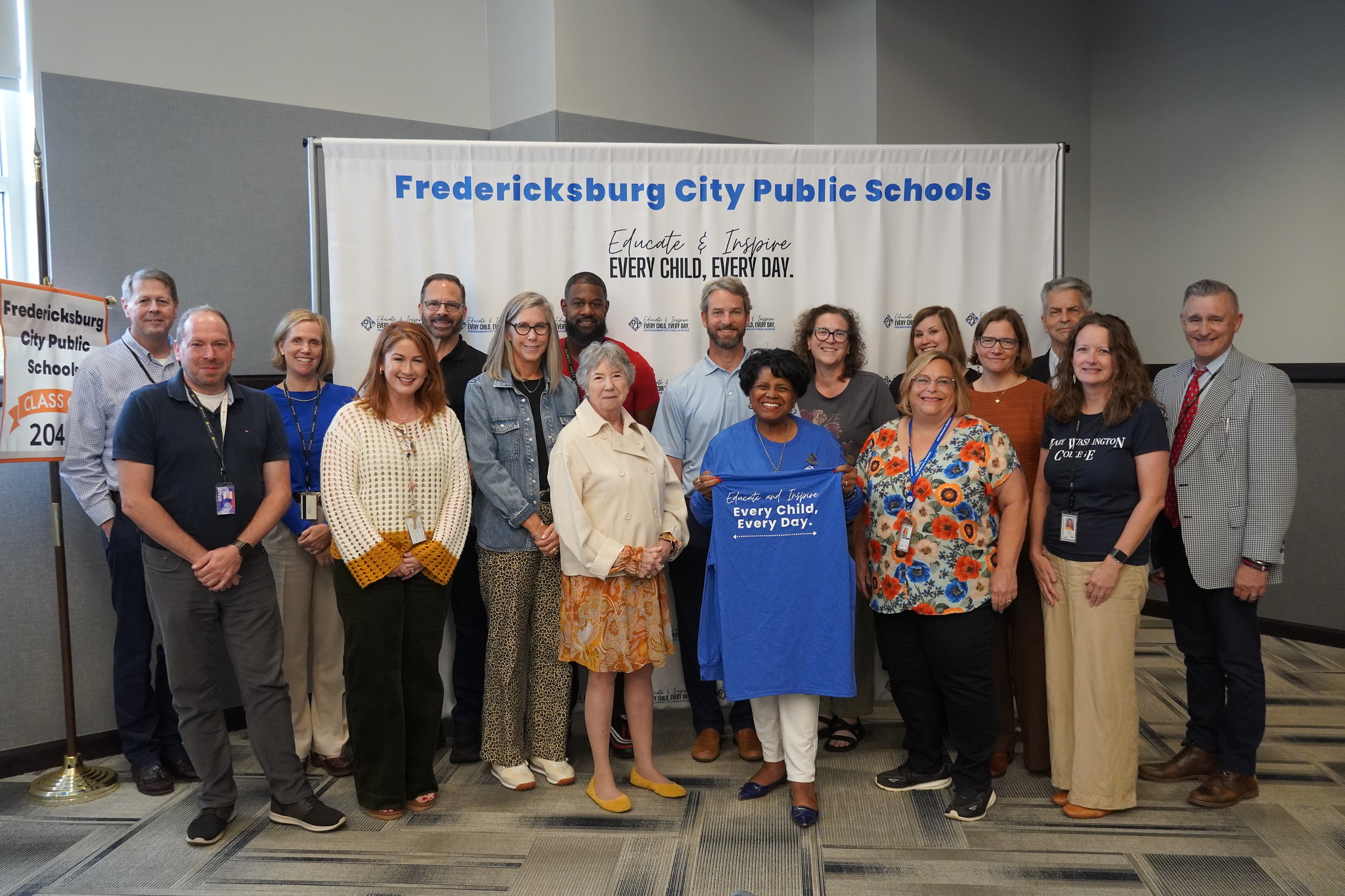
A T-shirt displays the new Fredericksburg City Public Schools tagline: “Educate and Inspire Every Child, Every Day.” (Photo by Grace Eberhardt/FCPS)
Some early versions of the logo focused on the city’s outline along with colorful text. The color palette reflected suggestions from FCPS students, who were invited to offer input throughout the process.
On brand
Mission statement: “The mission of the Fredericksburg City Public Schools is to educate and inspire each student to achieve their full potential.”
Vision statement: “The vision of Fredericksburg City Schools’ is to be a community of learners that embraces endless possibilities, empowering our students to make a positive impact on society.”
Tagline: “Educate and Inspire Every Child, Every day.”
“They gave us some interesting answers when we asked them how they felt about certain words, certain language, we had some laughs about it,” FCPS Communications Supervisor Katie Hornung said.
The direction of the logo changed following a public survey, which was conducted in 2023. Instead of a cityscape, a new concept emerged: a grid with a series of dots denoting the location of each city school, plus the Walker-Grant Center, which houses the division’s administrative offices and preschool programs.
“It was a total pivot,” Hornung said.
The new visual — sometimes referred to as a “mind map” — came from Anna Lowry, the marketing manager at the Central Rappahannock Regional Library. Lowry said that while some early designs included items typically associated with education, such as stacks of books and graduation caps, “we were trying to go deeper.”
She took it upon herself to research what happens to your brain when you learn, and the answer sparked inspiration.
“The original concept was actually neurons making connections,” Lowry said. “I’m no scientist, but when you learn something new, the neurons involved in the learning episode grow new projections and form new connections. Your brain may even produce new neurons.”

The new FCPS logo features a “mind map,” marking connections among the division’s schools.
Sonja Cantu, the city’s communications manager, then pitched the idea of overlaying a grid with a map of the city. The logo’s blue dots were chosen in part as a complementary color to the city’s existing branding.
“It became intentional that these not only represented connections and thoughtful processes,” said Hornung, “but also physically represented what we always thought.”


